
CUNY schools serve a student population as diverse as NYC itself—and sometimes more so
By: Michael Dorsch, Futures Initiative Fellow and Doctoral Student, Earth and Environmental Sciences, The Graduate Center, City University of New York
Key Points:
-
Across the CUNY system overall, race and ethnicity enrollment characteristics tend to match the race and ethnicity characteristics of the neighboring communities.
-
The percentages of Hispanic, Non-Hispanic Black, and Non-Hispanic Asian students enrolled in CUNY senior colleges are somewhat higher than the percentages in the neighboring communities.
-
At CUNY community colleges, the percentages of Hispanic and Non-Hispanic Black students enrolled are higher than neighboring communities.
In line with our core mission to advance greater equity and innovation in higher education, the Futures Initiative has undertaken a long-term research project of creating the “CUNY Map of NYC,” a series of student-researched and designed maps that demonstrate key aspects of the City University of New York (CUNY) as a consortium of diverse higher education institutions and, in particular, that document CUNY’s relationship to and impact upon New York City. The first of these maps is “The CUNY Sociodemographics Map of NYC,” a sociodemographic analysis of the communities closest to CUNY’s campuses. The twofold purpose is, first, to see the characteristics of people who are in walkable distance (defined as one mile from campus) and, second, to compare community characteristics with college population characteristics, as based on enrollment data from the CUNY Office for Institutional Research and Assessment.
Using data from the United States Census Bureau’s American Community Survey, we conducted a proximity buffer analysis in ArcGIS and selected community characteristics based on census tracts that fell within one mile from each CUNY campus. Once we had selected the nearest census tracts for each campus, we aggregated the sociodemographic variables we selected from the census data (race/ethnicity percentages) for each buffer zone. We then tabulated the aggregate numbers for comparison alongside CUNY enrollment data on race/ethnicity.
Initial results show complex patterns. Across the CUNY system, enrollment characteristics tend to match the geographic communities most closely located to their campuses. For example, the student population across CUNY includes 28.7% Hispanic, 24.8% black, 18.9% Asian, and 27.4% white. Meanwhile, the communities closest to campuses CUNY-wide are 25.5% Hispanic, 24.7% non-Hispanic black, 11.05% non-Hispanic Asian, and 34.61% non-Hispanic white. This suggests that the percentages of students that are Hispanic or non-Hispanic black roughly match the communities located nearest to CUNY campuses. Percentages for non-Hispanic Asian students are slightly higher than for the communities nearby, and percentages of non-Hispanic white students are lower than the community characteristics CUNY-wide.

Across senior colleges, there is a greater percentage of Hispanic students enrolled (23%) than the percentage of the population living near campuses that is Hispanic (18.5%). A similar pattern exists across senior colleges with the percentage of non-Hispanic black students enrolled (28.4%) versus the percentage of the community living near campuses (23.8%). The percentage of Asian student enrollment (18.4%) is also greater than the percentage of the population living near campuses that is non-Hispanic Asian (11.7%). Non-hispanic whites make up 28.7% of the students enrolled in senior colleges. By contrast, in the neighborhoods closes to senior colleges, 41.7% of the population is non-Hispanic white.

For the community colleges, these relationships are similar but even more pronounced—39% of students enrolled are Hispanic versus 25.9% of the surrounding community being Hispanic, 28.1% of enrolled students are black versus 12.5% of the surrounding community being non-Hispanic black, 16.6% of students enrolled are white versus 42% of the surrounding community being non-Hispanic white. For the Asian population, the community college enrollment rate at CUNY (15.9%) is similar to the non-Hispanic Asian percentage of the surrounding population (16.4%).

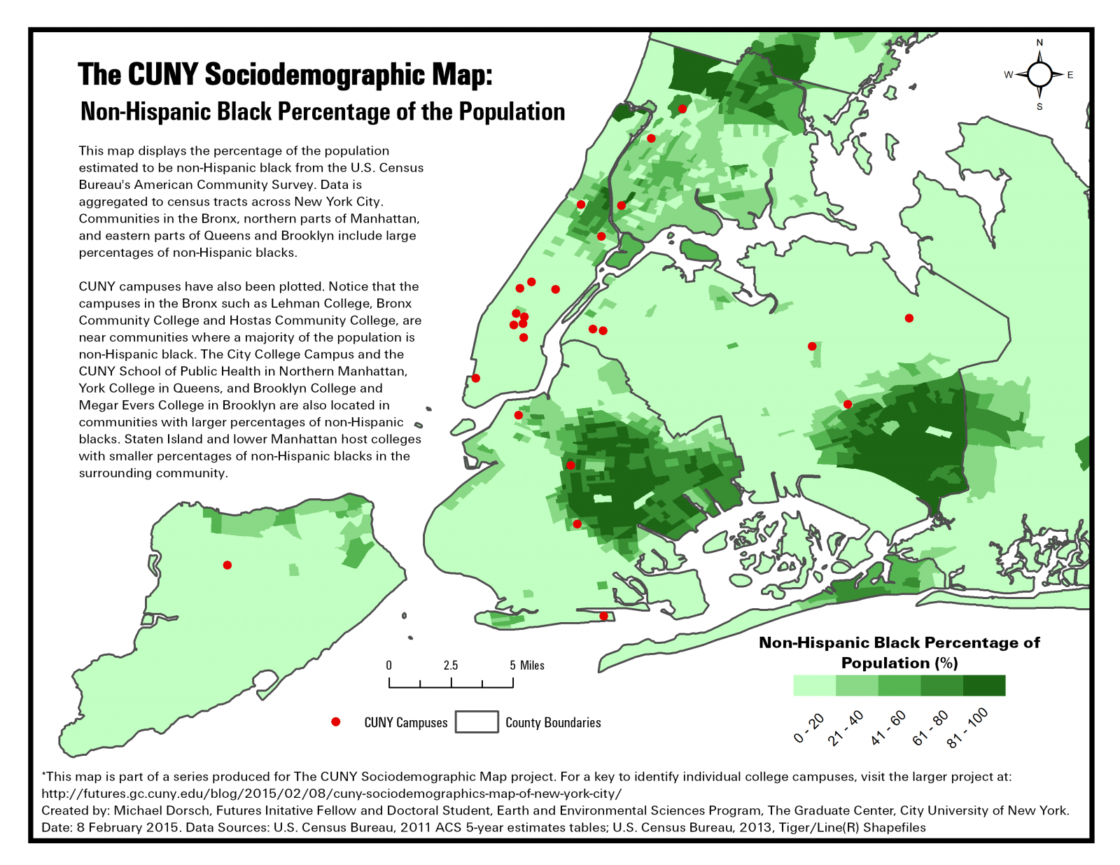
The maps included below are best viewed as a series. Compare and contrast the race and ethnicity maps with the maps on poverty, income, and bachelor’s degree attainment and correlational patterns emerge. Areas with lower average incomes, lower bachelor’s degree attainment, and higher percentages below the poverty line tend to be areas with greater racial and ethnic minority percentages of the population.


In addition to mapping the city-wide distribution of these sociodemographic characteristics, we also aggregated the percentages obtained from the buffer analysis in ArcGIS for each campus. These are available in the Maps Marker map below. The data on CUNY enrollment for each campus from the CUNY Office of Institutional Research and Assessment is also provided for comparison with the sociodemographic data from the census tracts within 1-mile of campus. Click on each marker to see the individual analysis snapshot for each campus in the CUNY system.
[mapsmarker layer=”5″]
Caveats and Future Directions
One factor to be cognizant of in these percentage numbers on enrollment used above is that campuses have a very large variation in enrollment numbers. For example, the Borough of Manhattan Community College (BMCC) has 26,606 students enrolled compared to 692 at Guttman Community College. The variation in community characteristics also fluctuates significantly between different colleges. BMCC, for example, has a student body that is 41.4% Hispanic, 31.2% black, 15.1% Asian/Pacific Islander, and 12% white, but the surrounding community is 8.3% Hispanic, 3% non-Hispanic black, 27.4% non-Hispanic Asian, and 58% white. BMCC then has a more diverse enrollment than its surrounding community. Meanwhile, Bronx Community College has enrollment numbers that more closely match the surrounding community composition. Enrolled students at Bronx Community College are 61.5% Hispanic, 32.5% black, 2.9% Asian/Pacific Islander, and 2.9% white, and the community percentages for race/ethnicity are 66.5% Hispanic, 24.6% non-Hispanic Black, 2.3% non-Hispanic Asian, and 2.9% white.
Another factor to consider is that enrollment numbers may be reflective of a certain age group (the average age of college students [18-24]). The community population numbers from the U.S. Census data are reflective of the entire population living around a campus (not just the college-aged population). This brings up the important distinction that this analysis is not comparing apples with apples. Based on the data that we have available and have used in this analysis, we cannot say whether the population being captured in the CUNY enrollment numbers is the same as the population captured in our city-wide buffer analysis of CUNY campuses. In all likelihood, the populations are not the same. Students enrolled at an individual campus may be coming from much farther than the immediate neighborhood (defined in as 1-mile from campus here). They may even be coming from another borough or from outside of New York City.
The only thing we can say with some certainty is what sociodemographic characteristics are like around the individual campuses, at least according to the census data used in this analysis. Comparisons can be made between the CUNY enrollment data and these neighborhood sociodemographic characteristics so long as we keep in mind the variations that may exist in the data we are looking at. Even with these caveats in mind, the fact that many of CUNY’s campuses have enrollment numbers that are more diverse in terms of race and ethnicity than the populations in their immediate neighborhoods is still interesting. Future research may try to delve into these relationships in greater detail by exploring age distributions and by looking at the actual geographic distribution of students enrolled in each CUNY college.
The next phase of this project to come in a follow-up post will be looking at economic and educational data in the neighborhoods around each campus.
How Was This Analysis Done?
We posed the following questions to guide our research:
- Do socioeconomic and demographic indications vary around different campuses in the CUNY system?
- Do the characteristics of neighborhoods surrounding the different CUNY campuses match the student enrollment at each of these institutions?
To try to answer the first question, we obtained data from the U.S. Census American Community Survey estimate tables “Hispanic or Latino Origin by Race” (ID=B03002), “Selected Economic Characteristics” (ID=DP03), and “Educational Attainment” (ID=S1501). After isolating the individual race/ethnicity variables we wanted to include as well as percentage of the population below the federal poverty line, percentage of the population with a B.A. degree, and mean income, we joined this data to census tract shapefiles in ArcGIS. We also added geocoded locations for each of the CUNY college campuses obtained by geocoding addresses for each CUNY campus. Next, we create 1-mile polygon buffers around each of the CUNY campus location points in ArcGIS and then used the selection tool to aggregate the socioeconomic/demographic data from census tracts that had their centroid within the buffer zone. Each of these selections were then exported as tables that could be used in Excel for comparison with the CUNY enrollment data. Maps were then created showing the sociodemographic data for census tracts city-wide along with the CUNY campus locations. Charts were created using the buffer analysis selection tables and the CUNY enrollment data from the CUNY Office of Institutional Research and Assessment. The flow chart below illustrates these steps.
Average income, educational attainment, and poverty rates of neighborhoods near CUNY campuses will be explored in the next phase of this work.

Note: Step by step instructions will soon be posted as resources for those interested in conducting their own similar analyses.


